The Dashboard
Home is the first page you see after signing in. It answers one question — is the application under test healthy right now? — and does not try to answer any other.
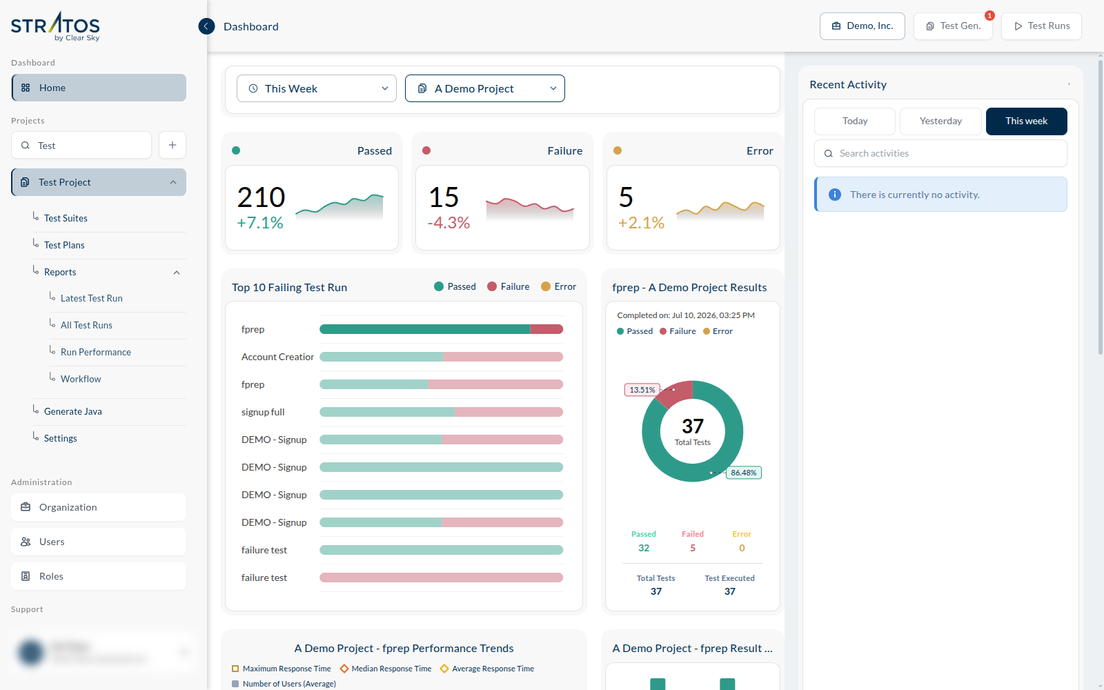
Choosing what you are looking at
Two controls at the top of the page decide what everything below counts:
- a time range — This Week by default
- a project scope — All Projects by default, or a single project
Everything on the page — the cards, the charts, the activity list — is recalculated from those two. If a number looks wrong, check these first: you are probably looking at a wider range, or at every project at once.
Results at a glance
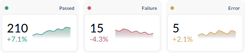
Three cards summarise every test that ran in the chosen period:
- Passed — the test did what it was supposed to do
- Failure — the application did not behave as the test expected
- Error — the test could not complete, for example because a page or an element never appeared
Each card shows the count, a trend against the previous period, and a sparkline of the days behind it. Failure and Error mean different things, and the difference matters: a failure is usually a finding about your application, an error is usually a finding about your test or the environment it ran in.
Top 10 Failing Test Run
A bar per run, each split into passed, failed and errored tests. The runs with the most trouble are at the top, so this is the shortest path from "something is broken" to "here is the run that shows it".
Latest run results
The donut on the right shows the most recent run in the selected scope: how many tests it contained, how many passed, failed and errored, and when it completed. Its title names the run and the project it belongs to.
For the full picture of a run — every test, every step, the evidence — open it from Reports.
Further down: trends
Scrolling down, the dashboard turns from what happened to which way it is going:
- Performance Trends — response times (maximum, median, average) and the number of users, run over run, for the most recent runs. The dashboard's answer to is it getting slower? — the full story lives in Run Performance.
- Top 10 Worst-Performing Runs — the slowest runs in the period, so a regression in speed is as visible as a regression in results.
- Result Trends — the pass/fail history of the latest run's feature, side by side per run.
- Insights — a placeholder today: AI-powered insights for this view are coming soon.
Recent Activity
The right-hand rail lists what has happened lately — filtered to Today, Yesterday or This week, and searchable. When nothing has happened in the period, it says so rather than showing an empty list.