Run Performance
A test can pass and still be telling you something is wrong. If the checkout journey took four seconds last month and takes eleven today, nothing failed — and yet something failed.
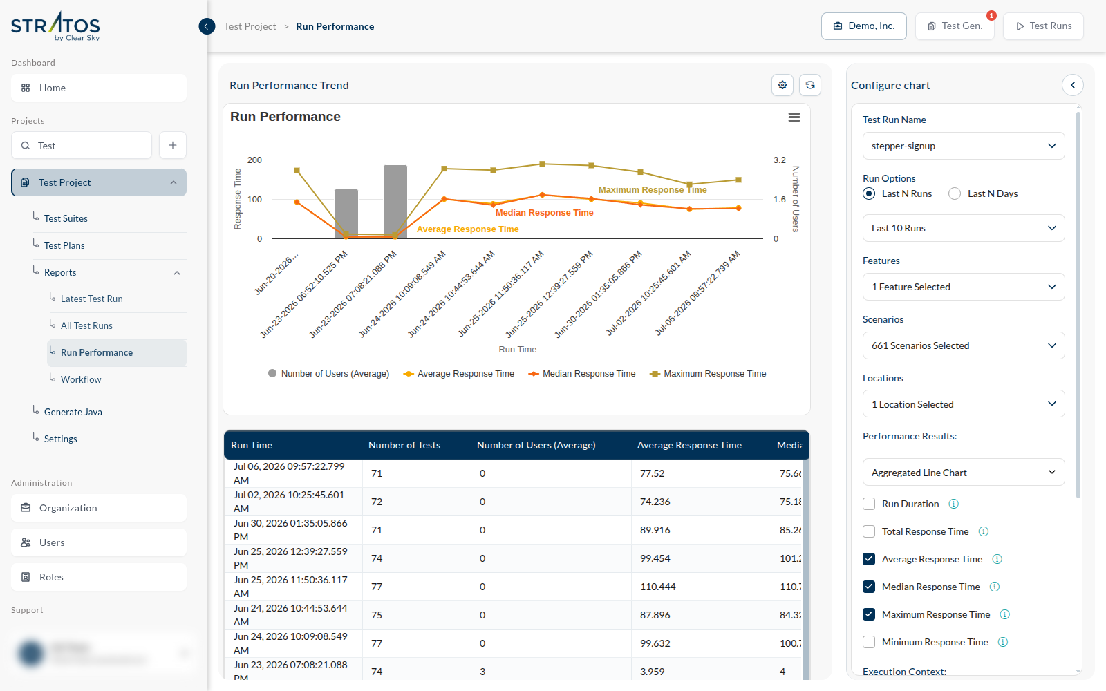
Run Performance, under the project's Reports, charts that: the Run Performance Trend, how long your tests take, run after run.
This is a report about your test runs, not a load test. It measures how long the journeys took when they ran; it does not generate traffic to see how the application copes. Concurrency belongs to the test plan — Number of Parallel IVU — not here.
Choosing what to plot
The screen opens empty — "Please select filter and apply" — because a trend across everything at once is a trend across nothing. Fill in the Configure chart panel on the right, then press Apply.
| Test Run Name | which plan's runs to chart |
| Run Options | Last N Runs, or Last N Days |
| Features | narrow to particular features |
| Scenarios | narrow further, to particular journeys |
| Locations | one region, or several — the same test is not equally fast everywhere |
Narrow it until the line means something. "Checkout, in Frankfurt, over the last thirty days" is a trend you can act on. "Everything, everywhere" is a line that moves whenever the mix of tests changes, which is not the same as your application getting slower.
Reading it
Watch for the shapes, not the numbers:
- A step — the line jumps on a particular date and stays up. Something shipped that day.
- A slope — a slow, steady climb. Usually growth: more data, more rows, more work per page.
- A spike in one location — not your application; the network or the region.
- Noise around a flat mean — normal. Do not go hunting.