Reports
Every run leaves a record. Reports, in the project's menu, is where you read them — four screens, each answering a different question.
| Latest Test Run | What happened in the run that just finished? |
| All Test Runs | Where do we stand - are we getting better or worse over time? |
| Run Performance | Are the tests run slower or faster? |
| Workflow | What work did the failures create? |
Latest Test Run
The report on the run that finished most recently. It opens on a row of tiles that give you the shape of the run before you read a single test:
PASSED / TOTAL · RUN DURATION · LOCATIONS · SIMULTANEOUS USERS · STAGES · REPLICATES
Underneath, the Run Result chart breaks the run down into passed, failed and errored.
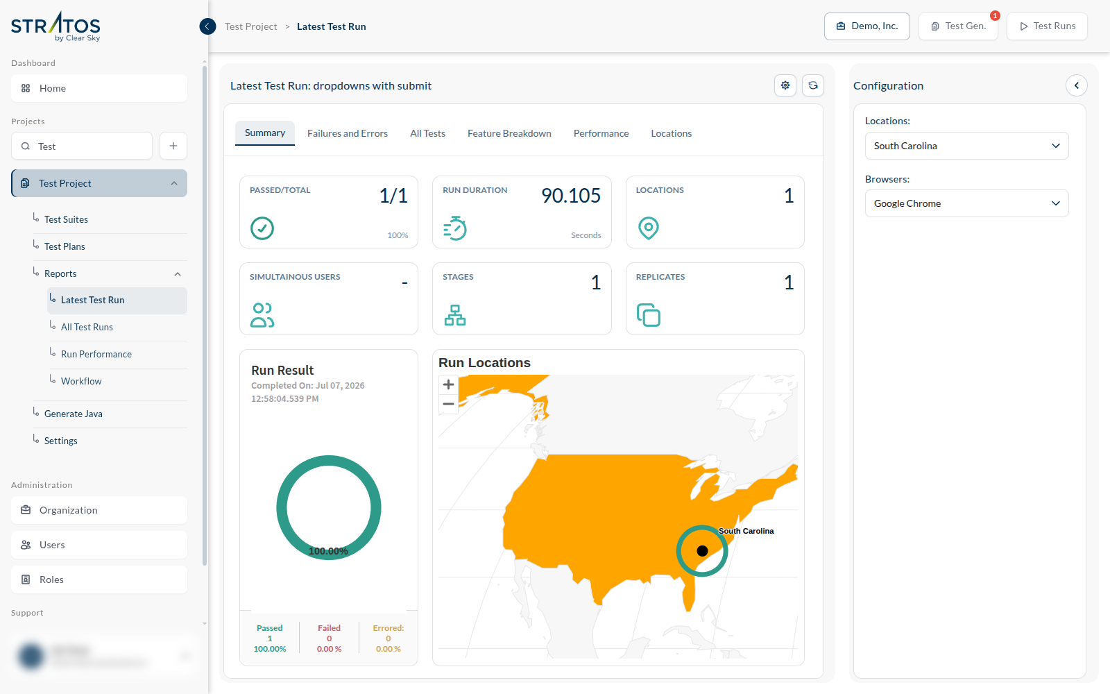
On the right is a Configuration panel with Locations and Browsers. At least one of each must be selected — until then the report says "Please select at least one location" and stays empty. The same tests can behave differently in Chrome and in Firefox, or from one region and not another, so the report always shows you a chosen slice rather than a silent average.
The tabs
| Summary | the tiles and the overall result |
| Failures and Errors | only what went wrong — start here |
| All Tests | every test in the run, whatever its outcome |
| Feature Breakdown | results grouped by feature, so you can see whether the damage is concentrated in one area |
| Performance | how long things took |
| Locations | results split by where they ran |
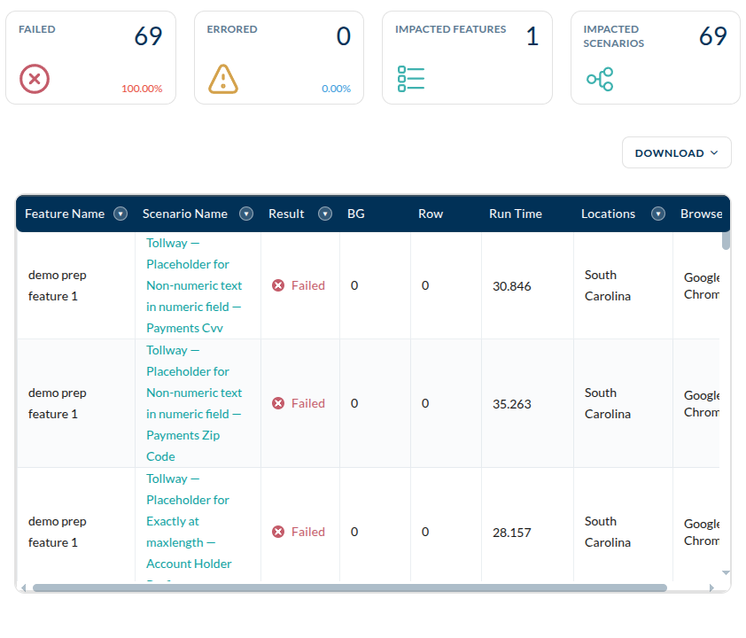
Failures and Errors is the tab that earns its keep. A green run needs no reading; a red one needs exactly this list. Open a failing test and you get its steps, the step that broke, and the evidence the run captured — which is why the screenshot setting on the plan matters.
All Test Runs
One run tells you about one build. The trend tells you about the project.
All Test Runs charts every run side by side — a column per run, split into passed, failed and errored — with a table beneath it listing each run by name, when it completed, and how it went.
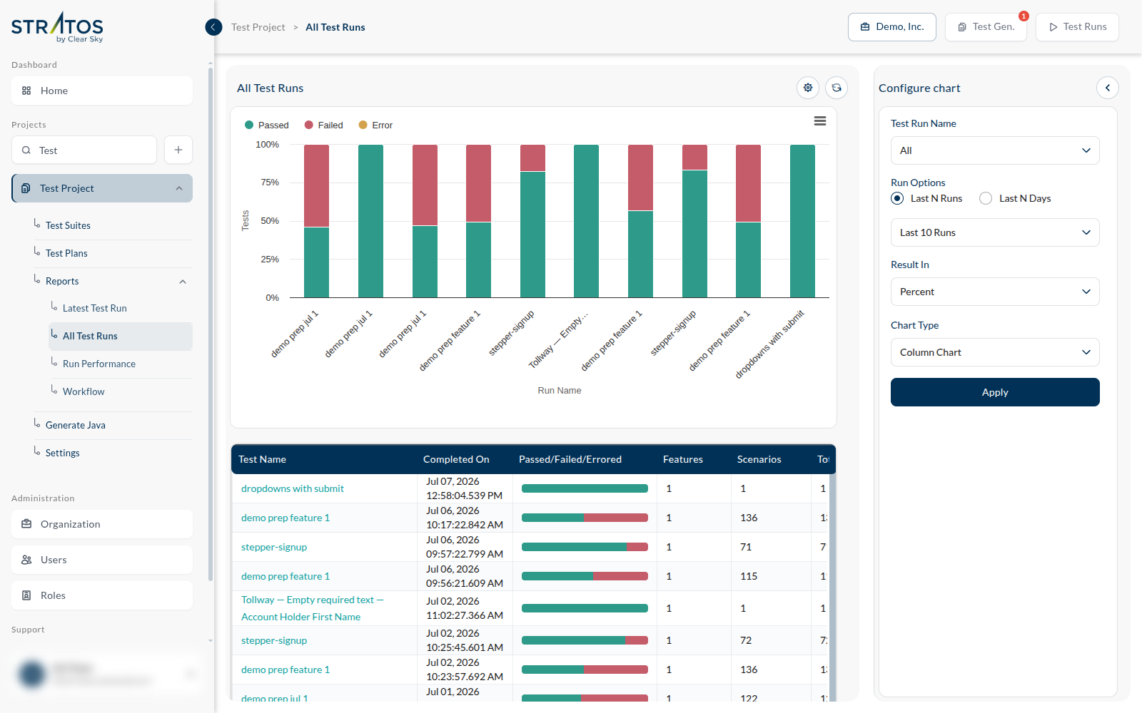
The Configure chart panel on the right decides what you are looking at:
| Test Run Name | narrow to one plan, or leave it open for all of them |
| Run Options | Last N Runs — the last ten runs, whenever they happened. Last N Days — everything in a window of time, however many runs that turns out to be. |
| Result In | absolute counts, or Percent. Percent is the honest one when runs contain different numbers of tests. |
| Chart Type | how to draw it — a column chart by default |
Then Apply.
A single red run is an incident. A slope is a problem — and this is the screen that tells them apart.